Look at the peak 2008 candle and the March 18 candle on EWBC.
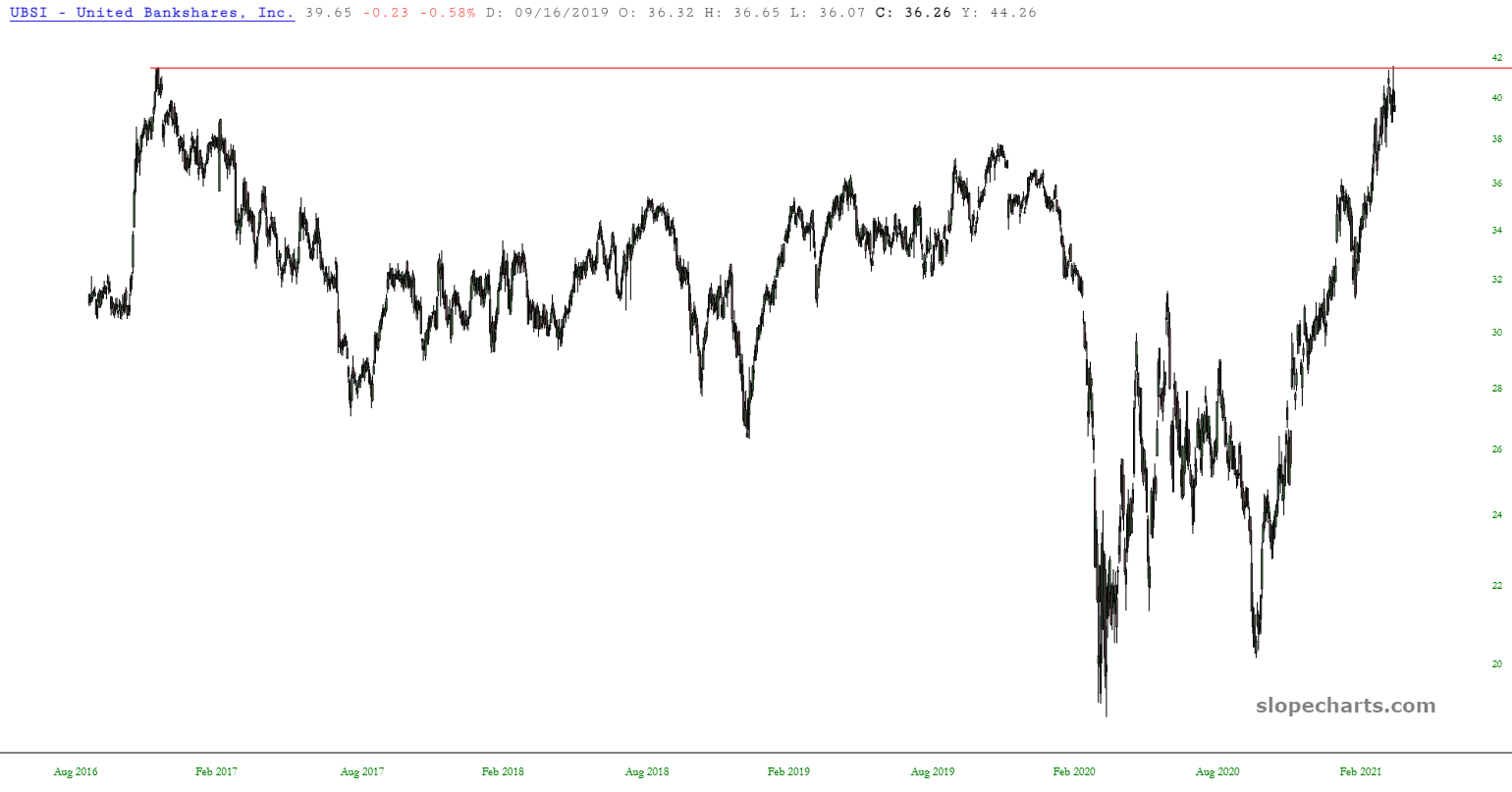
Here are a bunch of bank charts with near perfect touches of horizontals. Many more have similar patterns but have broken higher or not reached the horizontal. If rates have peaked, financials should be pulling back. I've noticed a lot of the prior peaks also have huge wicks on top (shooting star candles), similar to the March 18 candles. Firth Third (FITB) has a horizontal touch than goes back to 2002, with a similar wick.
These charts aren't selected for being the best trade setups (although I like EWBC as a short candidate). Rather if you like what you see, dig into the financial sector. These are all culled from regional bank ETF (KRE) holdings. I didn't look at any other funds or financial sectors. Finally, note these also look like great basing patterns if you are betting that rates are going higher along with economic activity. Bank stocks performed terribly during the stagflationary 1970s.

![[Most Recent Quotes from www.kitco.com]](https://lh3.googleusercontent.com/blogger_img_proxy/AEn0k_uqPP9GiT5xqH44QbDwRXPq-D7onI-TLpSscsHW8xY-XKlX43iiDGZDZ86amHDQKWFYYdxEIEeZkq3MaHC4ZERqIuLEY4DaVGbXOvm4-cI1MFokOP0KdzP4yoc=s0-d)


No comments:
Post a Comment